100 days to go. Apparently. Will it all still go ahead? *shrug emoji*
Categories
Tokyo Olympics: The Countdown Begins
100 days to go. Apparently. Will it all still go ahead? *shrug emoji*
100 days to go. Apparently. Will it all still go ahead? *shrug emoji*


Mmmm I want a milkshake now.
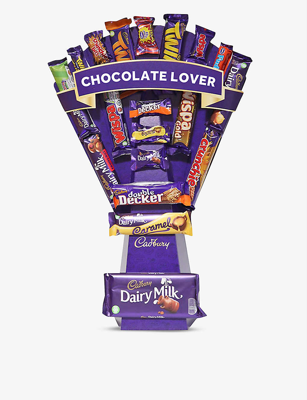
For the person in your life who has everything and flowers just won’t cut it… And if you ever wondered what 2 kilos of chocolate looks like, wonder no further.
D2C new platform launch comes to Coke where you can create your own ‘Jack and Mixers’ bundle amongst others.
I can’t resist some brand merch too. I’d go for the mason jars 🙂


Check it out at yourcoca-cola.co.uk
The choices we make reveal the true nature of our character.
Another great ad from Guinness.
http://www.youtube.com/watch?v=xwndLOKQTDs
Well done LG, racking up over 4m views so far.
What would you do in this situation?
Two quotes for you:
So, one weekend this summer, I rolled up my sleeves and dove into the trenches with our logo design team: Bob Stohrer, Marc DeBartolomeis, Russ Khaydarov, and our intern Max Ma. We spent the majority of Saturday and Sunday designing the logo from start to finish, and we had a ton of fun weighing every minute detail.
2) Kai Turner
It looks like something you’d find in a pack of clip-art. The bevel effect on the letters is atrocious. On her blog, Marissa Mayer says, “We spent the majority of Saturday and Sunday designing the logo from start to finish.” Two whole days? Well done. I think it’s an insult to logo designers and typographers who actually care about their craft to suggest that you can re-brand a billion dollar business with something you’ve knocked together over the weekend.
A lot of the initial reviews of the logo seem to be in consensus that the old logo was bad. The old logo maybe wasn’t as cleanly executed as it could have been, but at least it had style. It reminded me of the typography used in the old Warner Brothers cartoons. If I had been in Mayer’s shoes, I would have hired someone like House Industries to create a characterful typographic identity: a refresh that reflected the whimsy and playfulness of the old logo.
Here it is:

And here’s how they got there:

Along with a few variations along the way…

Also worth reading on the subject. Thanks for sharing, Tony Goff.
How about this for a joined up campaign.
Originally called Key Lime Pie, employees at Google soon realised that a) people don’t really know what Key Lime Pie tastes like and b) it didn’t resonate with a global, mass audience. So the jury was out, what to call the new 4.4 Android OS. Then they struck gold.
Let’s call it Android KitKat, and we’ll partner with KitKat themselves to make it happen. (I’m evidently massively oversimplifying this.)

No money is changing hands, the ideas was to do something “fun and unexpected”. But this isn’t something that Google just came up with overnight and went ahead. They’ve been talking with Nestle about the idea since November 2012, with some 11 months of planning having gone in to it. It only got finalised in February 2013 when Nestle executive vice president of marketing Patrice Bula, decided within an hour to go ahead.
It used to be Apple that would announce a new product without anyone previously knowing about it, shrouded under secrecy and mystery. Now even they get leaked sometimes months in advance. So this partnership will have come as a surprise to even most Googlers i’d imagine.
Here’s where you can start to understand the scale of the partnership: 50 million KitKat bars in 19 countries will have Android branding and consumers will have the opportunity to win a Nexus 7 tablet and Google Play gift cards. That’s incredible scale, Google have just tapped in to creating awareness about 1) Android 2) Nexus 7 and 3) Google Play.
Production of the wrappers started 2 months ago – it’s just amazing that it hasn’t come out until now.

Nestle is also producing a small run of 500 limited edition KitKats in the shape of the Android logo and have been sending them out to influencers. Here’s The Verge proudly showing theirs off. Clever influencer tactic too, getting the big hitters creating even more interest and demand.

All of this talk is making me hungry for a Kit Kat now…
It’s time to reboot this blog and what i’m using it for. If you’re coming here for infographics, i’m sorry but i’m no longer curating these as much as I used to.
I’ve been a little busy with BRANDSONVINE.COM and Share This Too which has just hit the shelves in all of the finest book shops.
Bear with me while I add a lick of paint around here. Thanks for your support.
The future is now.

Some nice reactive social content here from Dulux, noticing the colours of the spots by Damien Hirst on the 2013 Brit Award statue match their colours for 2013.


